feat(react-card): add selectable prop
#23349
Conversation
📊 Bundle size report
Unchanged fixtures
|

Asset size changesSize Auditor did not detect a change in bundle size for any component! Baseline commit: a827840680beff7297d0fc27425ea20426a00de3 (build) |
Perf Analysis (
|
| Scenario | Render type | Master Ticks | PR Ticks | Iterations | Status |
|---|---|---|---|---|---|
| Avatar | mount | 1363 | 1382 | 5000 | |
| Button | mount | 1021 | 1045 | 5000 | |
| FluentProvider | mount | 2285 | 2235 | 5000 | |
| FluentProviderWithTheme | mount | 742 | 753 | 10 | |
| FluentProviderWithTheme | virtual-rerender | 714 | 730 | 10 | |
| FluentProviderWithTheme | virtual-rerender-with-unmount | 786 | 755 | 10 | |
| MakeStyles | mount | 2017 | 2052 | 50000 |
|
This pull request is automatically built and testable in CodeSandbox. To see build info of the built libraries, click here or the icon next to each commit SHA. Latest deployment of this branch, based on commit 9b0e88e:
|
| </div> | ||
| <CardFooter> | ||
| <Button id="open-button" onClick={alert} appearance="primary"> | ||
| <Button id="open-button" onClick={() => console.log('open-button clicked')} appearance="primary"> |
There was a problem hiding this comment.
Avoid usage of alert.
There was a problem hiding this comment.
wondering what is the best practice here ?
There was a problem hiding this comment.
I found that alert doesn't work with Cypress (on WSL at least) so I went with something more reliable. Output isn't really used for anything, so maybe we remove it?
| interactiveNoOutline: { | ||
| ':hover::after': { | ||
| ...shorthands.borderColor(tokens.colorTransparentStrokeInteractive), | ||
| }, | ||
| ':active::after': { | ||
| ...shorthands.borderColor(tokens.colorTransparentStrokeInteractive), | ||
| }, | ||
| }, |
There was a problem hiding this comment.
Merged into each separate appearance style to simplify assignment logic later on.
packages/react-components/react-card/src/components/Card/useCardStyles.ts
Show resolved
Hide resolved
| const interactive = | ||
| state.root.onClick || | ||
| state.root.onMouseUp || | ||
| state.root.onMouseDown || | ||
| state.root.onPointerUp || | ||
| state.root.onPointerDown || | ||
| state.root.onTouchStart || | ||
| state.root.onTouchEnd; |
There was a problem hiding this comment.
selectable prop now controls intractability.
There was a problem hiding this comment.
Actually, this was an incorrect assumption. Card should still get interactive styles without selectable if it is "interactive". We'll need to double check what interactive means but for now we'll keep this logic.
packages/react-components/react-card/src/components/Card/useCardStyles.ts
Show resolved
Hide resolved
| </div> | ||
| <CardFooter> | ||
| <Button id="open-button" onClick={alert} appearance="primary"> | ||
| <Button id="open-button" onClick={() => console.log('open-button clicked')} appearance="primary"> |
There was a problem hiding this comment.
wondering what is the best practice here ?
packages/react-components/react-card/src/components/Card/useCardStyles.ts
Show resolved
Hide resolved
packages/react-components/react-card/src/components/Card/useCardStyles.ts
Show resolved
Hide resolved
| </Card> | ||
| ), | ||
| { | ||
| includeRtl: true, |
There was a problem hiding this comment.
RTL not necessary, already tested in non-interactive test.
| onClick: onChangeHandler, | ||
| onKeyDown: (event: React.KeyboardEvent<HTMLDivElement>) => { | ||
| if (event.key === Enter || event.key === Space) { | ||
| event.preventDefault(); |
There was a problem hiding this comment.
Not a fan at all of preventing browser defaults but, if we don't, it will otherwise collide with our interception of Spacebar usage. Open to more elegant solutions.
There was a problem hiding this comment.
q: curious if we might have this funcionality somewhere else already so we can make it generic and reuse for consistency?
There was a problem hiding this comment.
I checked the demos and run into interesting situation. is this supposed to work like following ?
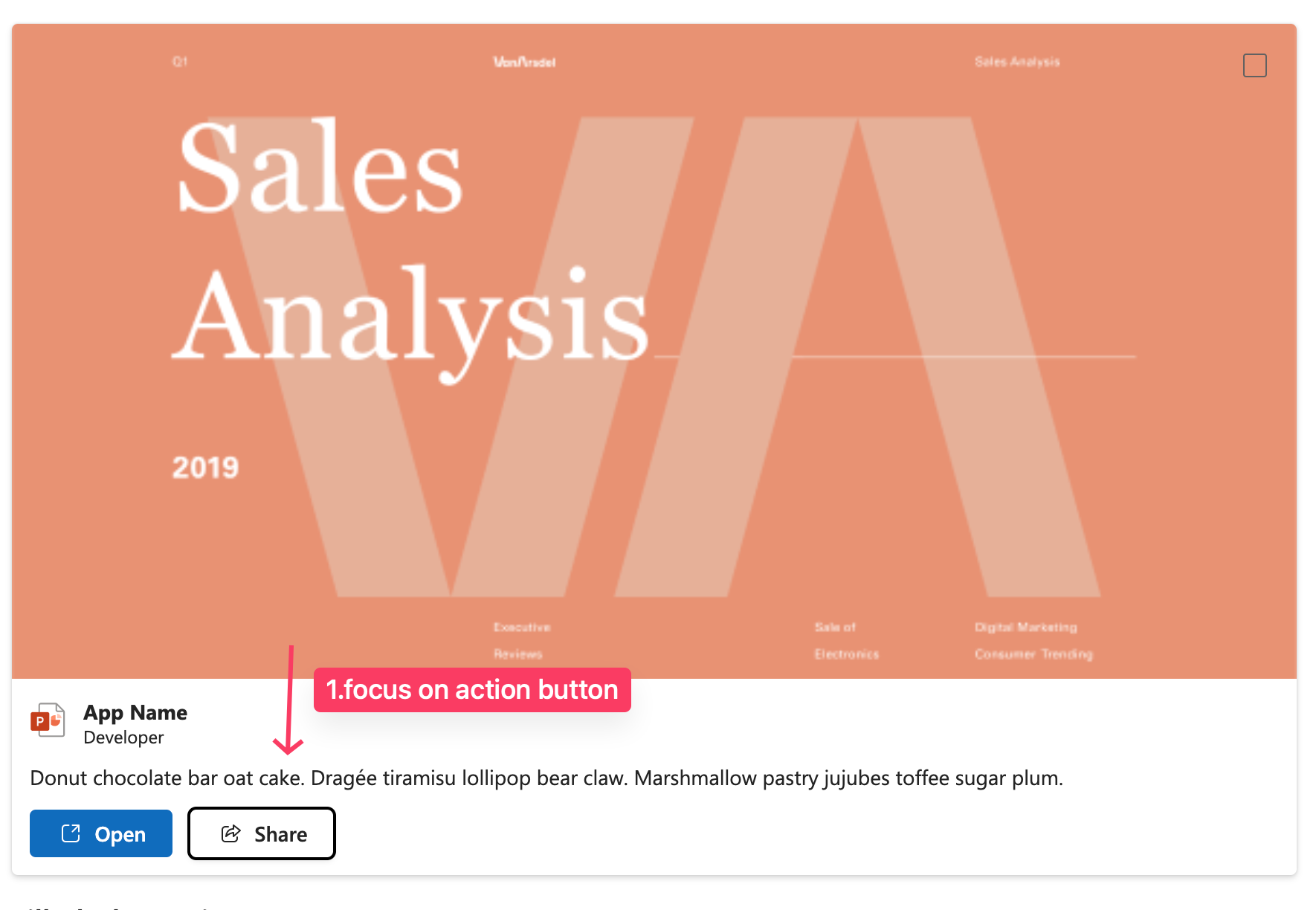
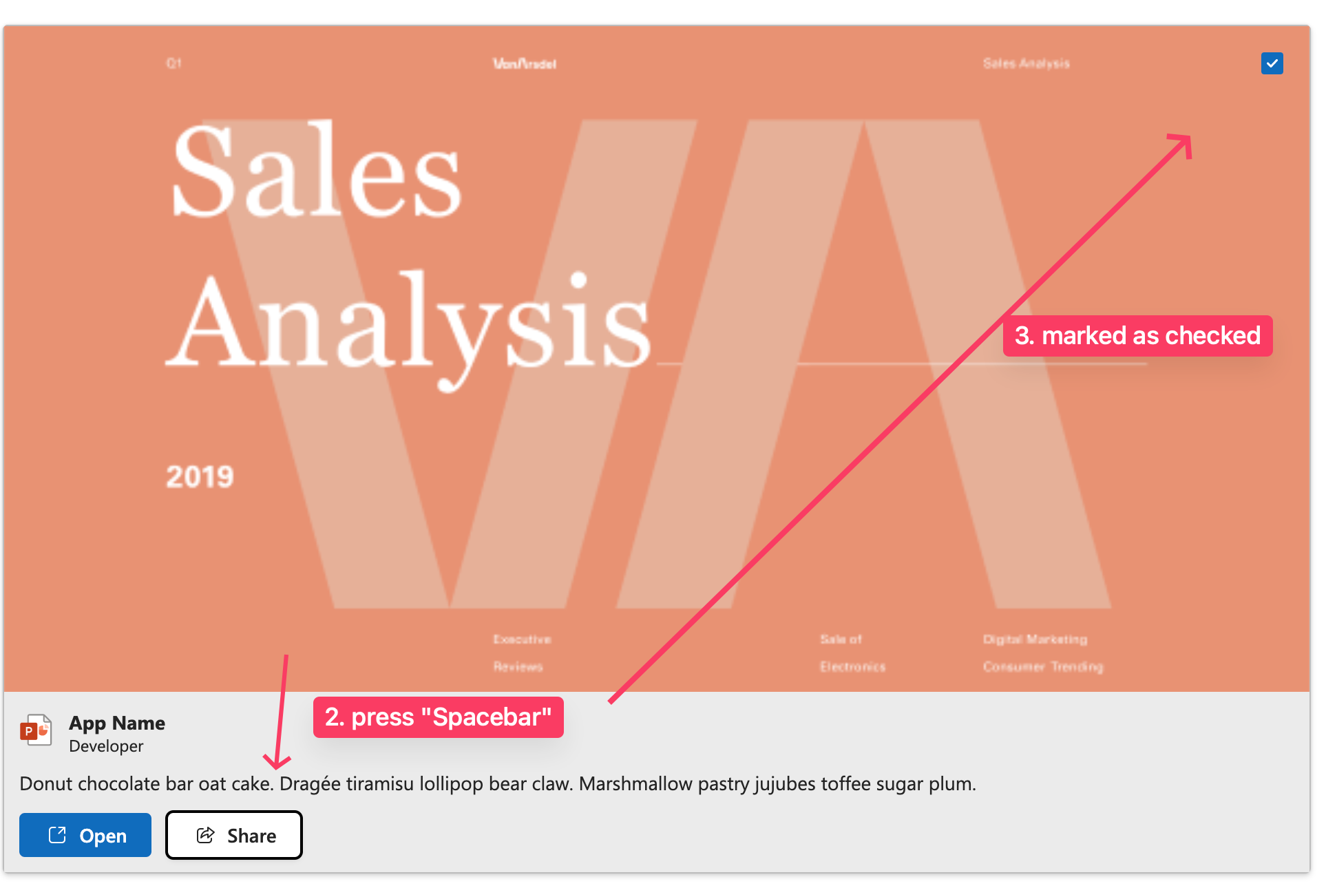
There was a problem hiding this comment.
Not a fan at all of preventing browser defaults but, if we don't, it will otherwise collide with our interception of Spacebar usage
what behaviour are you referring to, scrolling the page ?
There was a problem hiding this comment.
Under the focus of a checkbox, as you mentioned, Spacebar already checks it. This will check the checkbox, but the event is then bubbled up to the Card handler and it gets checked again.
I'll need some time to analyze this and find out a better approach.
There was a problem hiding this comment.
I'm also now thinking about how this will interact with the requested focus behaviors, given that Enter is supposed to "go into the card" and focus the inner elements. I guess we need to bring this up with design and clarify.
There was a problem hiding this comment.
yeah, to me that behaviour is kinda confusing as both events will trigger (selectable and action click) which also ads some lag (freezes UI for second or so - might be Storybook related though). I'd expect to not mark it as selected if I click on action control
| onClick: onChangeHandler, | ||
| onKeyDown: (event: React.KeyboardEvent<HTMLDivElement>) => { | ||
| if (event.key === Enter || event.key === Space) { | ||
| event.preventDefault(); |
There was a problem hiding this comment.
q: curious if we might have this funcionality somewhere else already so we can make it generic and reuse for consistency?
| export const useCardStyles_unstable = (state: CardState): CardState => { | ||
| const styles = useStyles(); | ||
|
|
||
| const hasInteraction = |
There was a problem hiding this comment.
wondering if this is what we want, enabling "magic" behaviour based on some props defined ? should we be rather explicit with our APIs ?
There was a problem hiding this comment.
Do you mean having an interactive prop that would enable said styles? I'm afraid that if we want to guarantee interaction styles and we need to rely on the user knowing beforehand such a prop is required will only lead to misalignment between intended design behavior and the use case.
This would be the result:
<Card interactive onClick={() => {}}>{...}</Card>
<Card interactive selectable selected={selected} onCardSelect={() => {}}>{...}</Card>
If the user misses this, they get no cursor: pointer / styles when clicking and when selected.
There was a problem hiding this comment.
What I meant is that in current state, the API is not explicit (mainly from Types API surface perspective). Based on this logic I don't have to provide selectable only some of the event handlers you're checking for, which will turn that behaviour on.
There was a problem hiding this comment.
Do you mean having an interactive prop that would enable said styles?
yes to have this explicit if possible
| onClick: onChangeHandler, | ||
| onKeyDown: (event: React.KeyboardEvent<HTMLDivElement>) => { | ||
| if (event.key === Enter || event.key === Space) { | ||
| event.preventDefault(); |
There was a problem hiding this comment.
I checked the demos and run into interesting situation. is this supposed to work like following ?
| onClick: onChangeHandler, | ||
| onKeyDown: (event: React.KeyboardEvent<HTMLDivElement>) => { | ||
| if (event.key === Enter || event.key === Space) { | ||
| event.preventDefault(); |
There was a problem hiding this comment.
Not a fan at all of preventing browser defaults but, if we don't, it will otherwise collide with our interception of Spacebar usage
what behaviour are you referring to, scrolling the page ?
Co-authored-by: Martin Hochel <hochelmartin@gmail.com>
5 participants
New Behavior
Added the
selectableproperty which will control:onClickand anonKeyDown(Enter key only) event on the card element and anonChangeevent to the checkbox. These will all flip theselectedstate's value and then call theonCardSelectprop methodRelated Issue(s)
#19336